I design CRO-led experiences for D2C brands — audits, experiments, and shipped redesigns tied to revenue. 30+ brands. Measurable results.
Running structured CRO audits across 10+ D2C brands — turning behavioural data into ICE-sc...
Ravelcare had high traffic and low ATC conversion. 60+ SKUs, no personalisation, decision ...
Auth redesign cut checkout steps from 7 to 3. A complete reward and referral system built ...
Before: every brand started from scratch — ad-hoc fonts, inconsistent components, slow han...
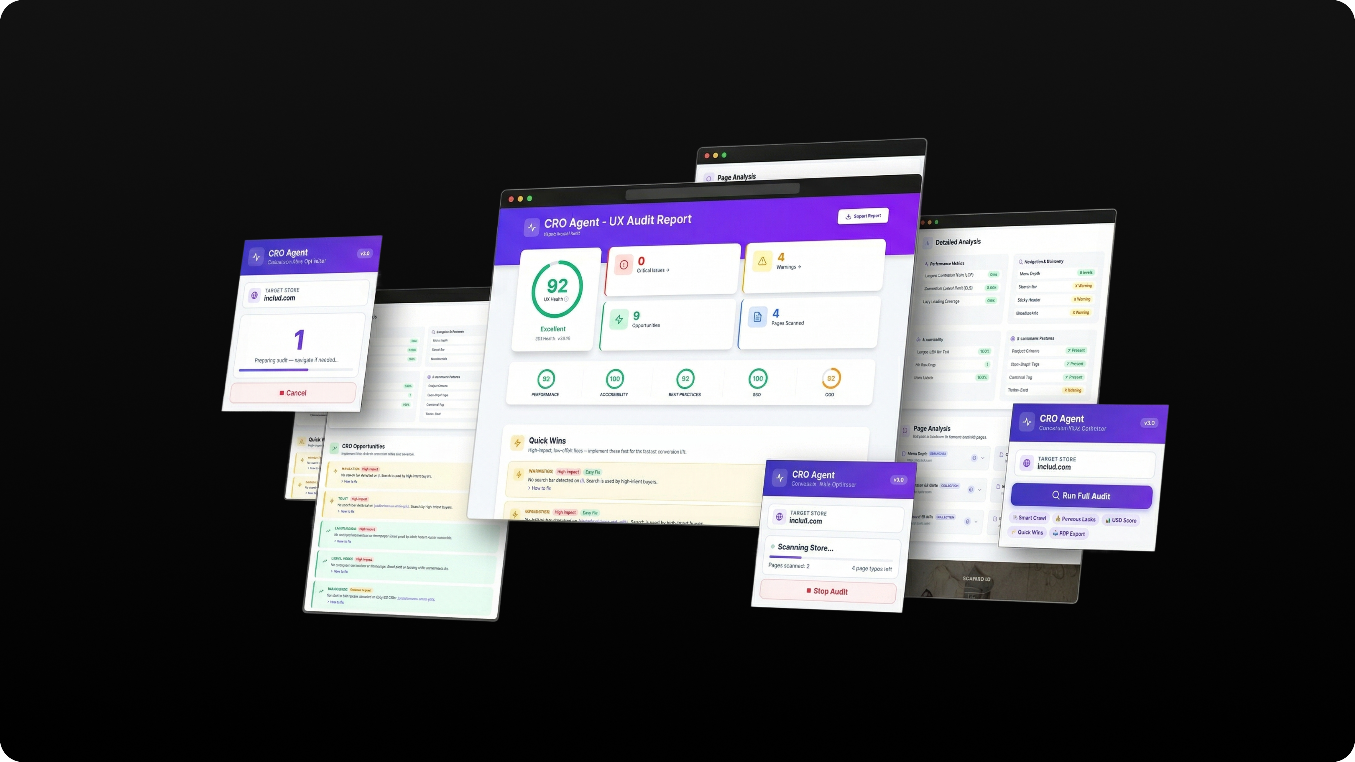
Automates heatmap review, funnel gap identification, and ICE scoring across e-commerce brands — reduces manual audit time significantly.
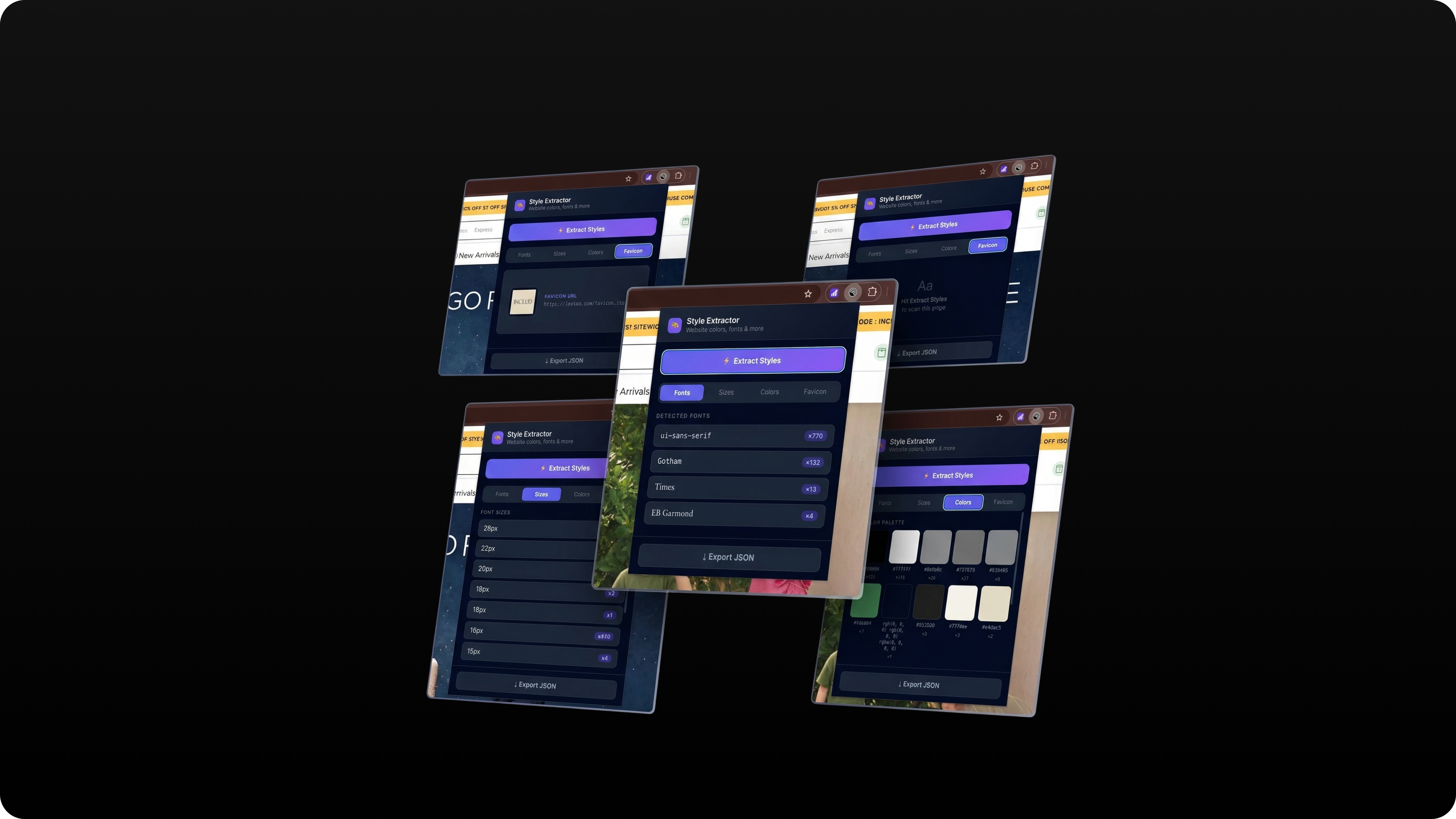
Extracts and exports Shopify theme configurations efficiently — enables rapid design handoff and theme migration across brands without manual file digging.
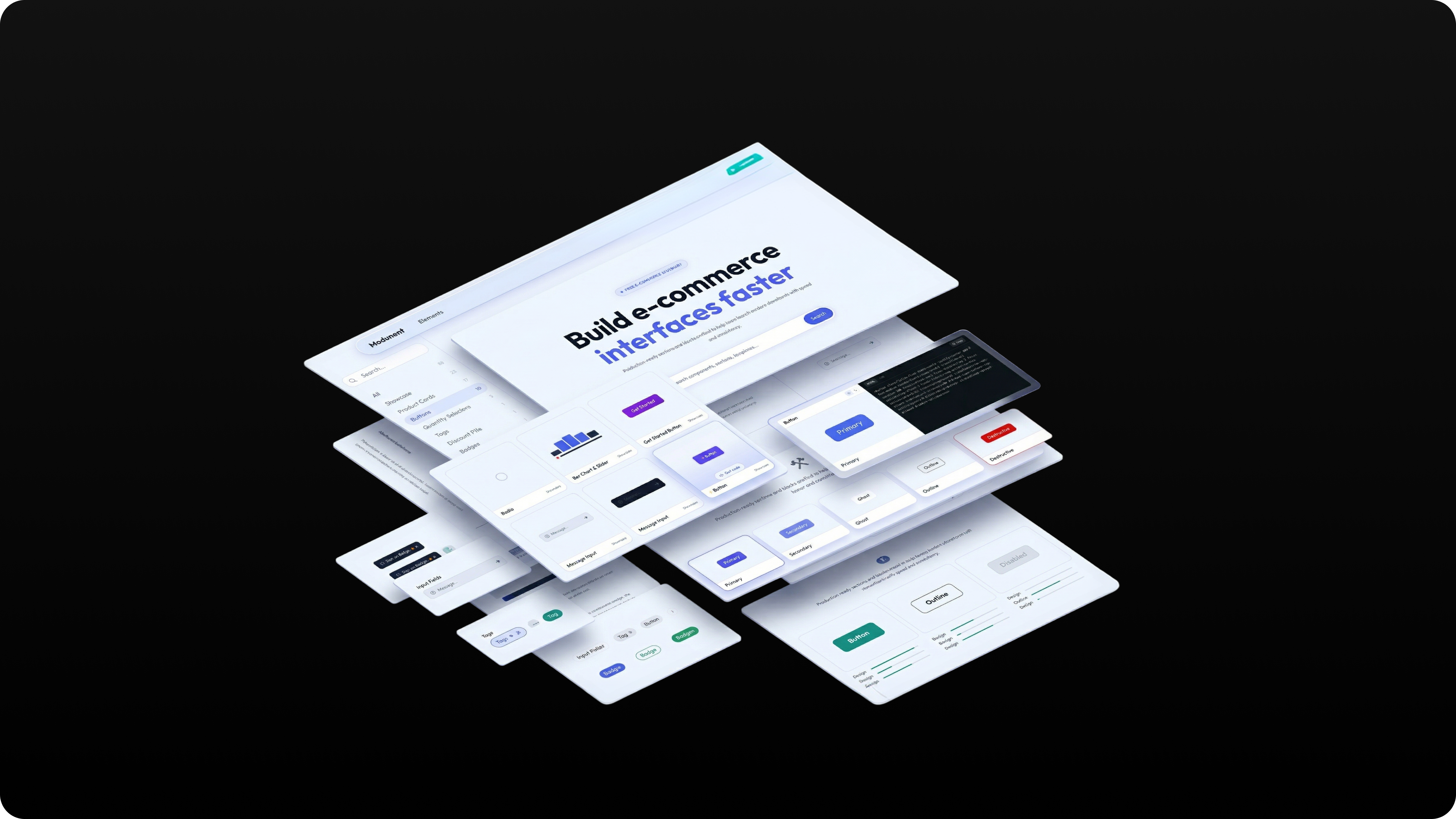
Created, designed, and launched a comprehensive personal UI elements library website — a living reference for consistent component design across all D2C projects. Covers typography, colour tokens, spacing, interactive states, and full component documentation.
Built to serve as a single source of truth across 30+ brand engagements — reducing inconsistency in design handoffs and cutting component re-creation time.
I'm Vineet — Senior Product Designer specialising in CRO, e-commerce experimentation, and commerce UX. I work at Tectonic designing for D2C brands that need design decisions tied to revenue, not just aesthetics.
My process: audit the funnel, find the friction, build the hypothesis, ship the test.
Sole designer running structured CRO audits across 10+ D2C brands — turning behavioural data into ICE-scored backlogs and A/B-tested redesigns tied directly to revenue.
Every friction point is a revenue leak. As lead designer at Tectonic, I built a repeatable audit-to-ship methodology across 10+ D2C brands: behavioural audit → ICE-prioritised backlog → design sprint → controlled A/B test → ship. Each cycle ran in 2–4 weeks. Every change had a defined success metric before design began.
Across 10+ D2C brands, the same pattern repeated: high traffic, broken conversion. Every brand was making design decisions by intuition — no behavioural data, no prioritisation framework. Avimee Herbal was a clear example. Strong organic traffic, but session data revealed three compounding issues:
The same diagnostic ran across every brand. Every finding was ICE-scored before any design work began. Highest-confidence issues shipped first within the 2–4 week sprint window.
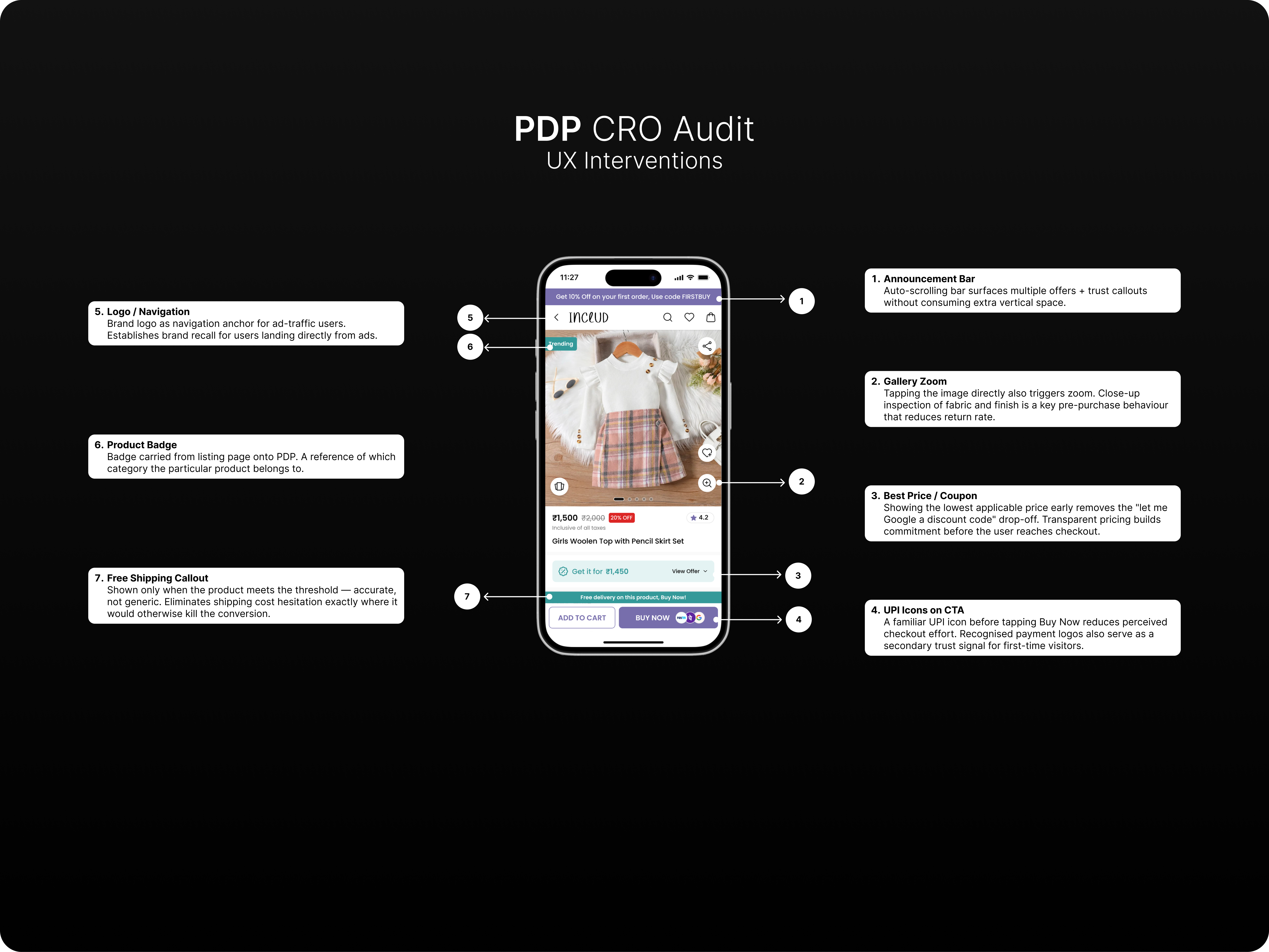
Every audit produced a friction map before a single pixel was moved. The Saadaa PDP audit diagnosed an 86% drop-off at the size selection step — heatmap and exit data made the cause undeniable. Each intervention was scored against evidence before any design began. Key decisions:
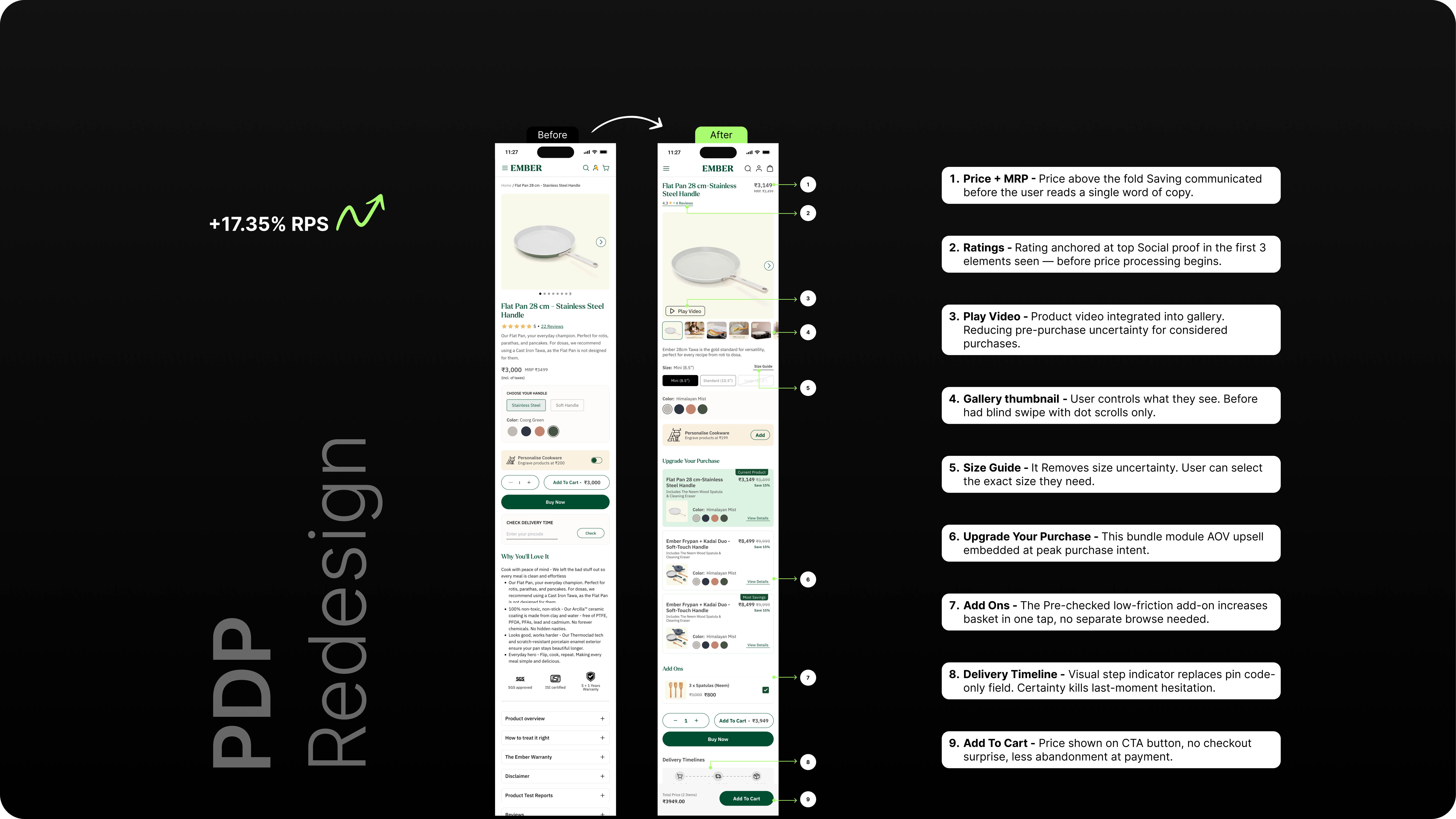
Commerce UX fails when it uses designer-logic hierarchy. Users don't think in "product details" — they think "will this fit?" Restructuring PDPs around user mental models drove consistent RPS lifts across every brand.
Every redesign ran as a controlled A/B test before full rollout. The Ember PDP redesign — the first application of the full framework — returned +17.35% RPS. That became the proof of concept for every brand that followed.
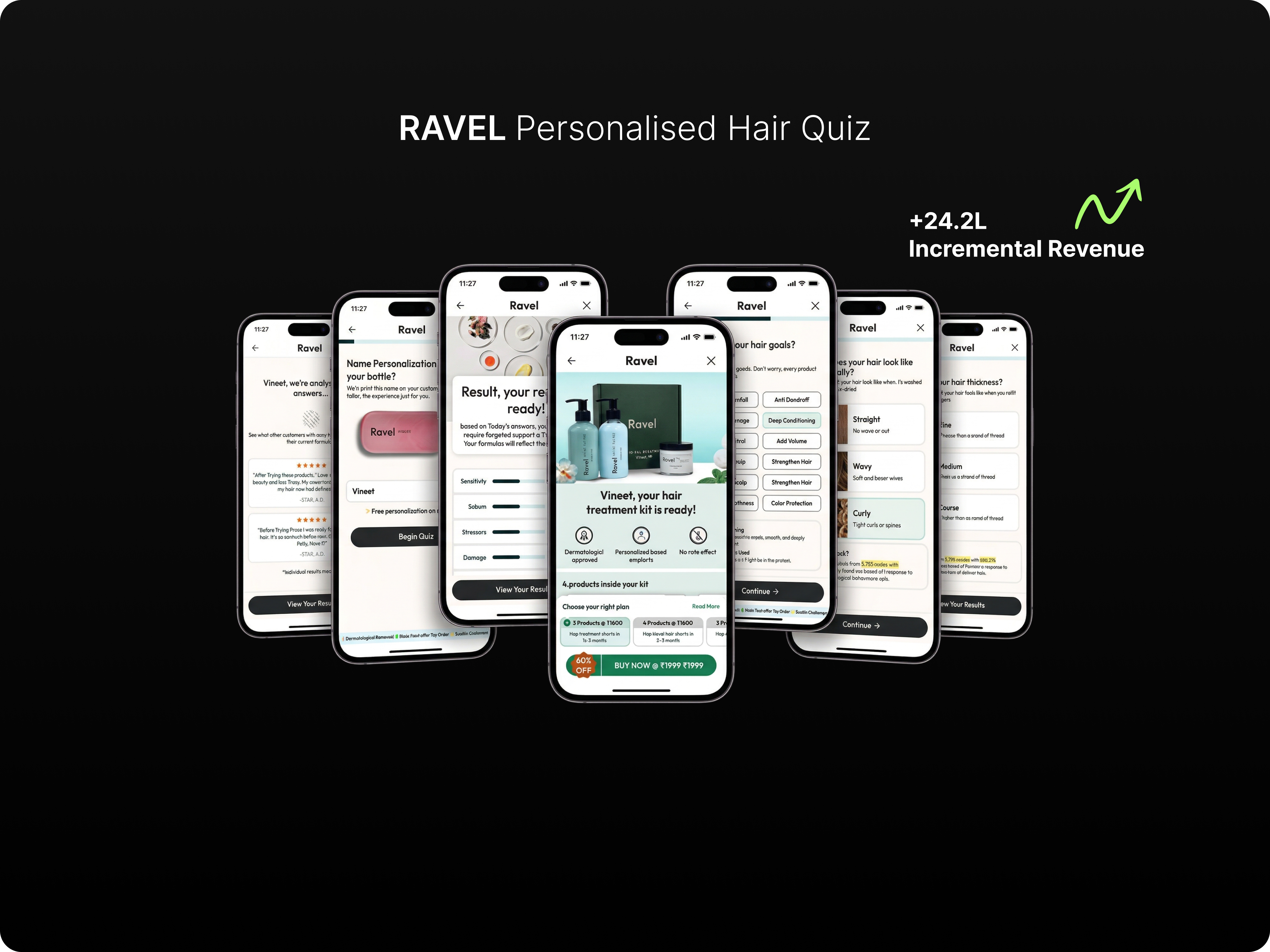
Ravelcare had high traffic and low ATC conversion. 60+ SKUs, no personalisation, decision paralysis. A 4-question branching quiz replaced the PLP and became the site's #1 converting entry point.
Before the quiz, Ravelcare's users landed on a standard category page with 60+ SKUs and no filtering by concern. Session replays showed rage clicks, repeated back-navigations, and 60%+ exit rates. The problem wasn't the products — it was decision paralysis. Sole designer, one PM, two engineers, 6 weeks.
Quantified through research before a single wireframe was drawn:
Hypothesis: If we replace the flat PLP with a guided flow that matches intent to product, ATC conversion will rise significantly. The quiz needed to feel like advice from an expert — not a filter dropdown.
A 4-question branching quiz designed to reduce decision load at every step:
The PLP gave users 60 choices. The quiz gave 4 questions leading to 2–3 recommendations. Same products, radically different cognitive load. This is why the quiz outperformed direct PDP traffic — users arrived at the right product with confidence.
Prototype tested with 8 users before development. Validated: users understood the flow without instruction and felt confident in recommendations.
What I'd do differently: instrument per-question drop-off from day one. We only added that tracking in week 3 — losing 3 weeks of optimisation data.
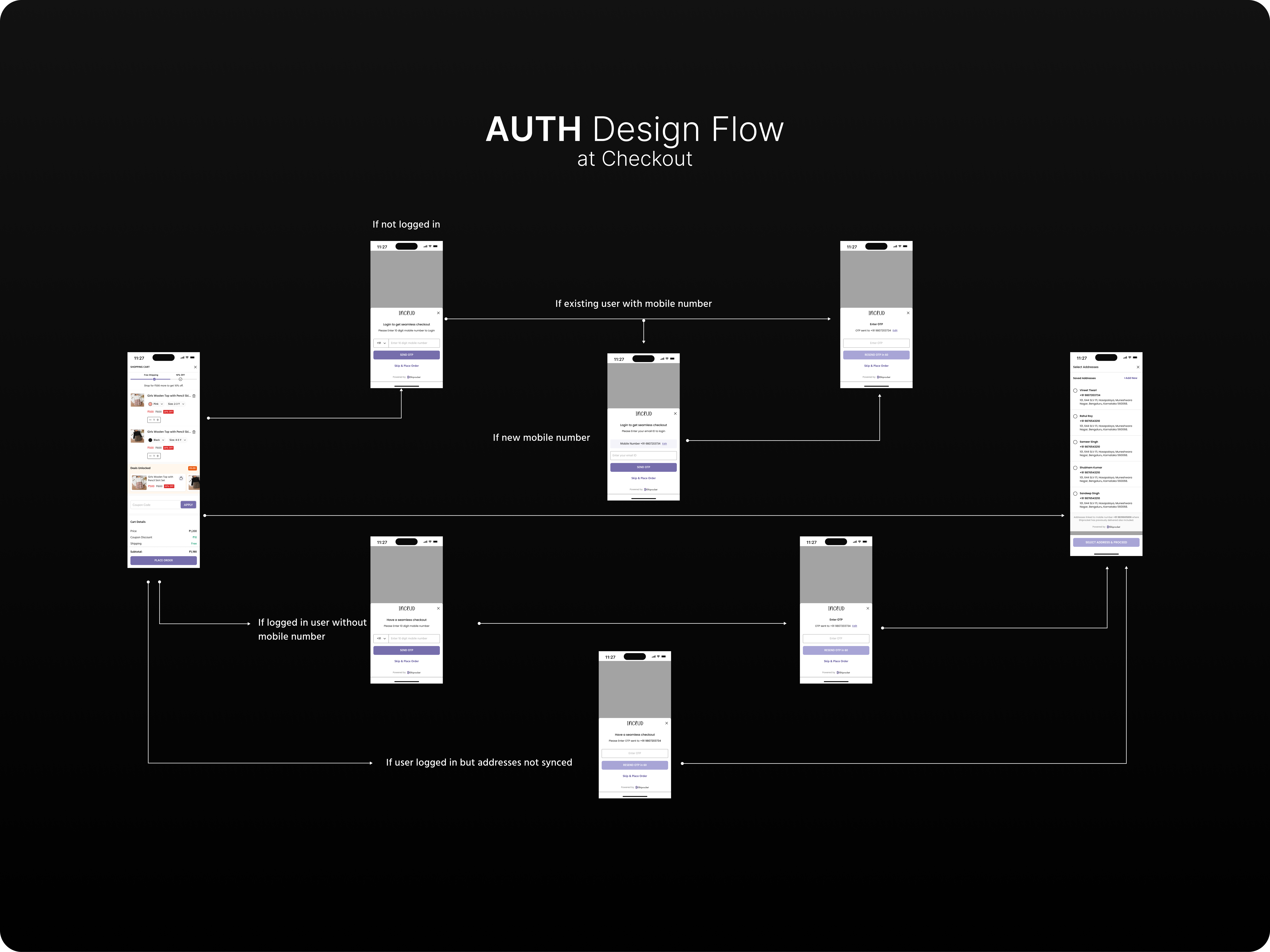
Auth redesign cut checkout steps from 7 to 3. A complete reward and referral system built from scratch. Cart redesign retained +45L/week. All three shipped on Includ.
Acquisition gets users to the cart. Everything after — login friction, no loyalty incentive, confusing cart UX — determines whether they buy once or return. At Includ, I owned the full post-click experience across three parallel workstreams. All three shipped. All three had measurable outcomes.
The problem: Funnel data showed 34% of users dropped at the checkout login step. The existing flow forced all users through one path regardless of their state.
I mapped all 5 auth states and designed an optimised path for each:
The old flow asked all users for all information upfront. The new flow asks for the minimum required at each state. Returning users see 3 steps. New users see a lightweight path. Both reach checkout faster with less friction.
Includ had no loyalty mechanism — every purchase was a first purchase from a retention standpoint. I designed the complete system from scratch, constrained to Shopify metafields and an existing third-party loyalty app:
10 specific interventions. Staged rollout to isolate signal from each change:
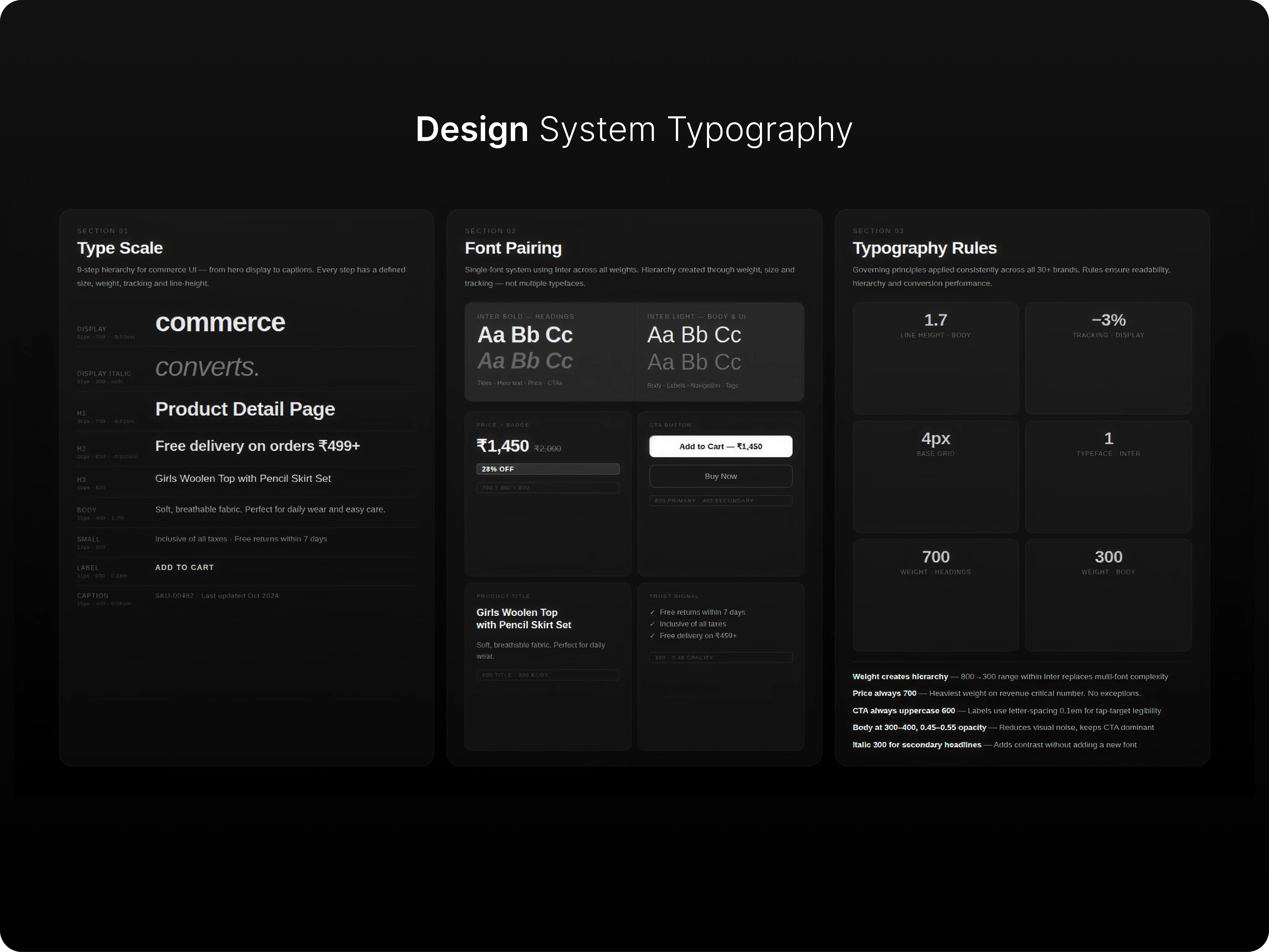
Before: every brand started from scratch — ad-hoc fonts, inconsistent components, slow handoffs. After: a shared typography system, 5 native checkout extensions, and a PDP framework that delivered +17.35% RPS on first deployment.
When you design for 30+ brands, the bottleneck isn't creativity — it's consistency and speed. I built a shared design language across three layers: a 9-step typography system, 5 Shopify Checkout Extensions, and a reusable PDP redesign framework. Together they cut new brand setup time and eliminated the most common review conflicts.
Before: Brand designers chose fonts by intuition. Each storefront had different hierarchies, weights, and line-heights. Reviews were wasted on font debates instead of UX decisions.
I built a 9-step scale — Display through Caption — with three governing rules:
Adopted across all 30+ brands. Eliminated font-related review debates entirely. New brand type setup dropped from a 2-day discussion to a 30-minute application of the scale.
Checkout is Shopify's most locked surface — theme.liquid doesn't touch it. I designed and spec'd 5 native extensions strictly within the UI Extension API:
A 9-point PDP structure, ranked by impact across audits. Not a template — a prioritised intervention list layered in based on brand-specific audit findings:
Deployed first on Ember's mobile store. +17.35% RPS. Now the default starting point for every new brand PDP at Tectonic.
Senior Product Designer specializing in CRO, e-commerce experimentation, and Shopify ecosystems. Over a decade of design experience — the last 3+ years laser-focused on building high-converting digital commerce for 30+ brands. I lead through systems thinking, visual design, behavioural UX, and data-informed design decisions.